Show site selector as text only when only one site is available #16972
Conversation
|
Thanks for this @sgiehl it actually looks still like a button now and when I click on it, nothing happens and it feels like a bug. Also it doesn't really help making the UI easier etc. I would say lets remove the border but it looks not quite right and isn't helping that much either Ideally we would remove the entire site selector which be fine for > 90% of users (and therefore would make UI better) but I think that's not wanted. So can we instead, when there's only one site, change the "All websites" button and make it a "create new website" button (when user is super user and keep "all websites" for all other users)? Only if it's easily doable though. Otherwise we can also postpone this issue. |
|
After all, maybe we could remove the selector completely when there's only one website, as making the UI simpler for most people is probably more valuable indeed.. |
You mean one website at all or one website available for the user? |
|
@sgiehl when only one site exists overall |
|
Ok. The site selector is now hidden in the top controls when only one website exists overall. |
70e6e60
to
9479a22
Compare
Description:
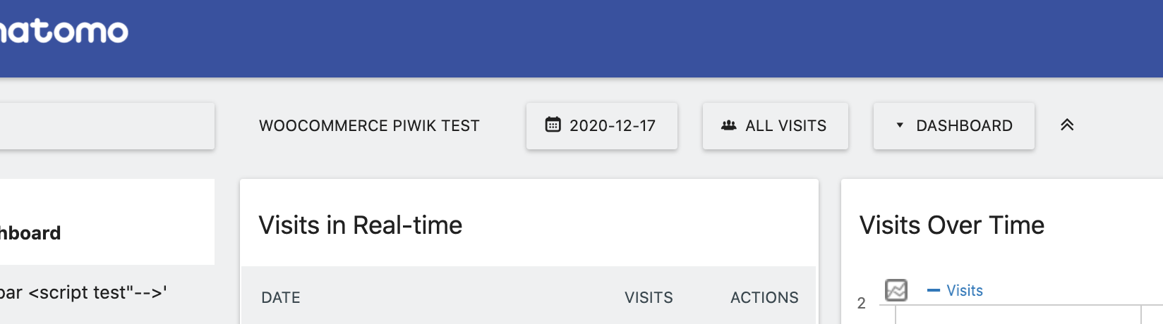
When only one website is available, the site selector will no longer work as selector. Instead all highlight effects are removed and the dropdown arrow is hidden as well. (Let me know if the UI should be modified even more.)
The site selector will also be shown this way while the list of available sites is loaded.
The list of sites will now be loaded automatically when the site selector is initialized. Before that was done on open only.
fixes #16789
Review